We Love Graphic Design 2023
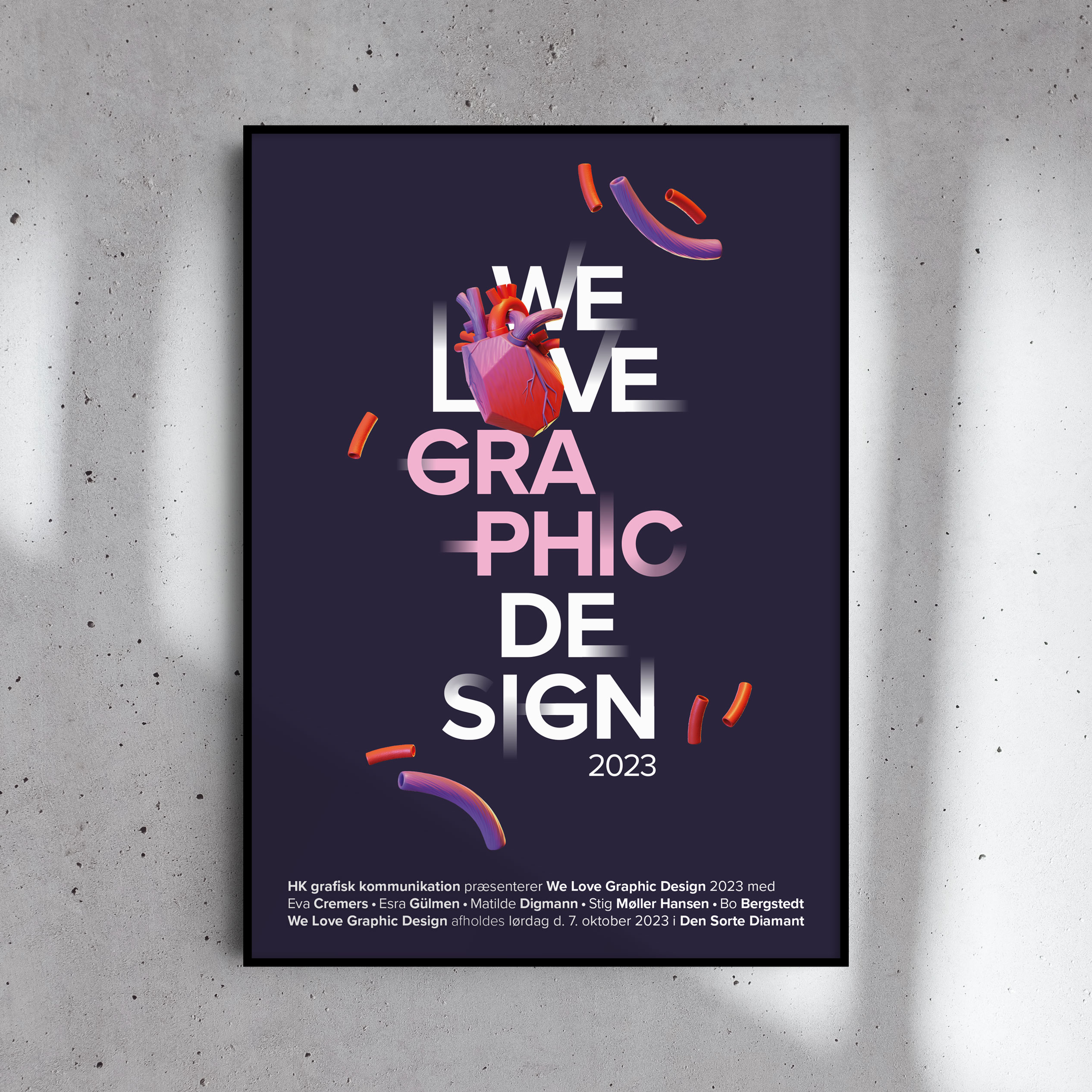
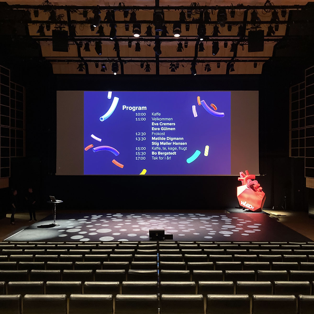
We Love Graphic Design is a 1-day conference for creatives. It is held in the Royal Danish Library (the Black Diamond) in October and features inspiring talks from Danish and International profiles from the Creative fields. In 2023, the event organizers asked Polykrom to create an identity for that year’s event.
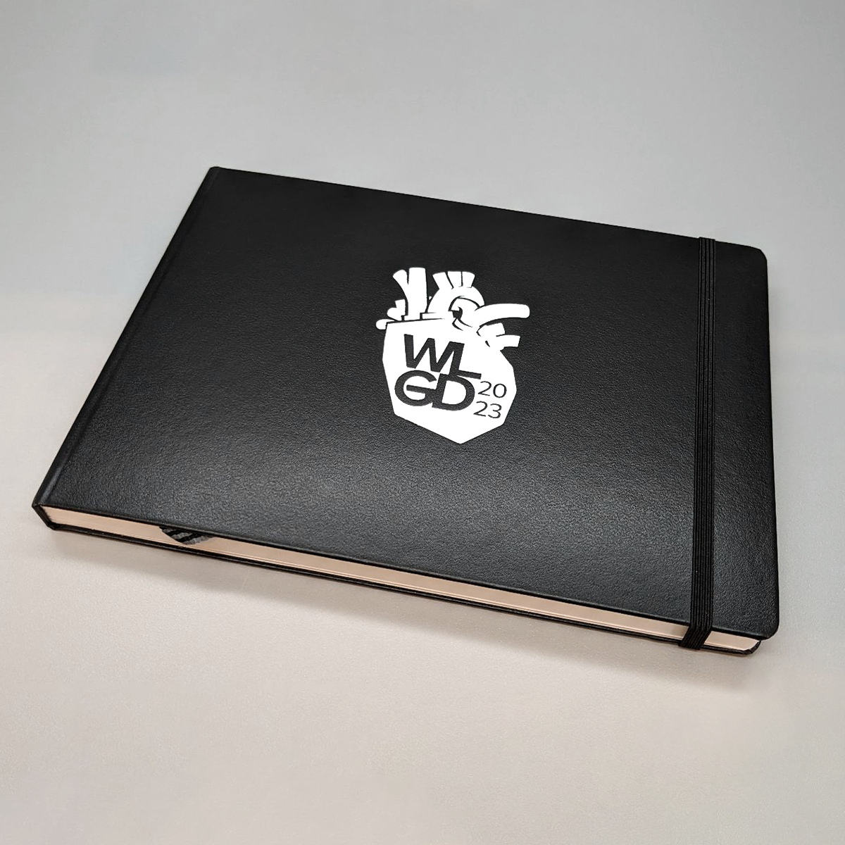
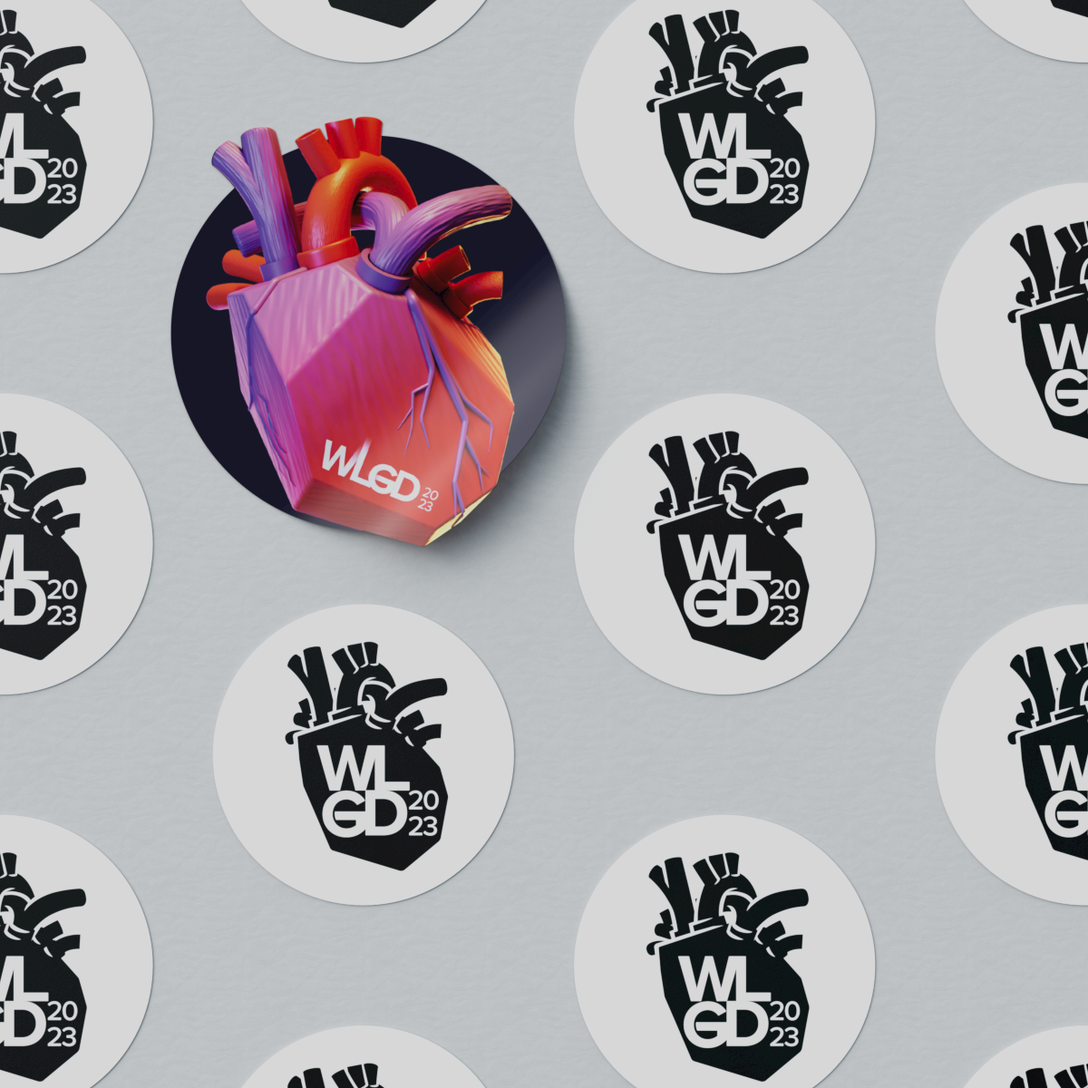
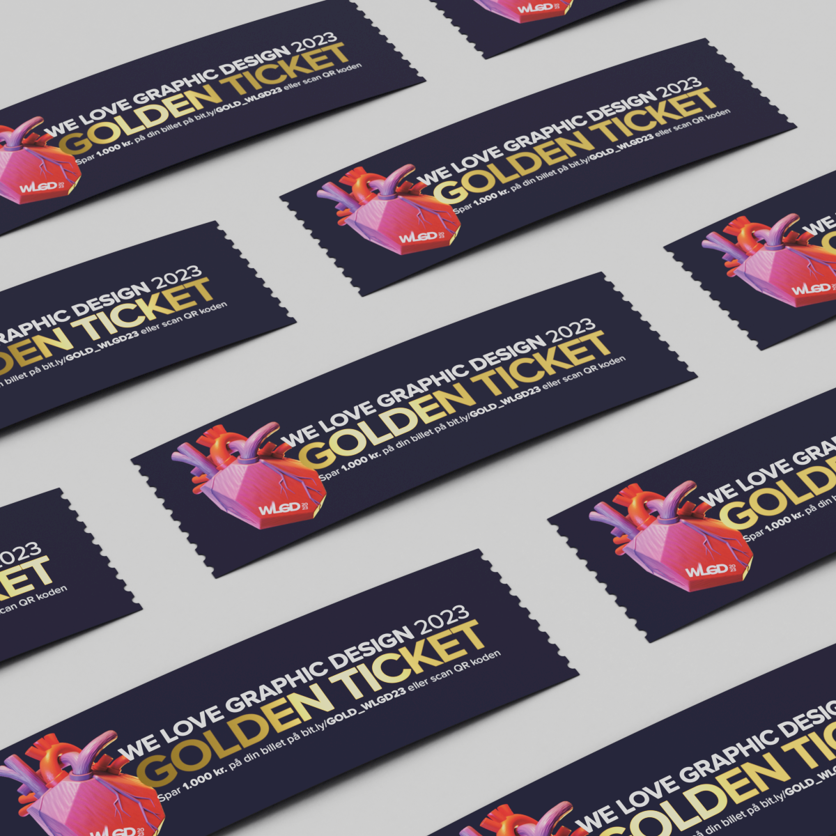
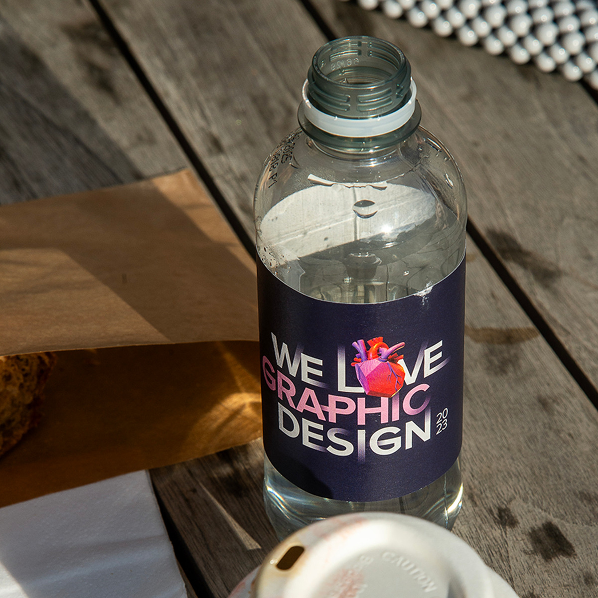
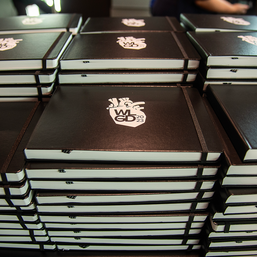
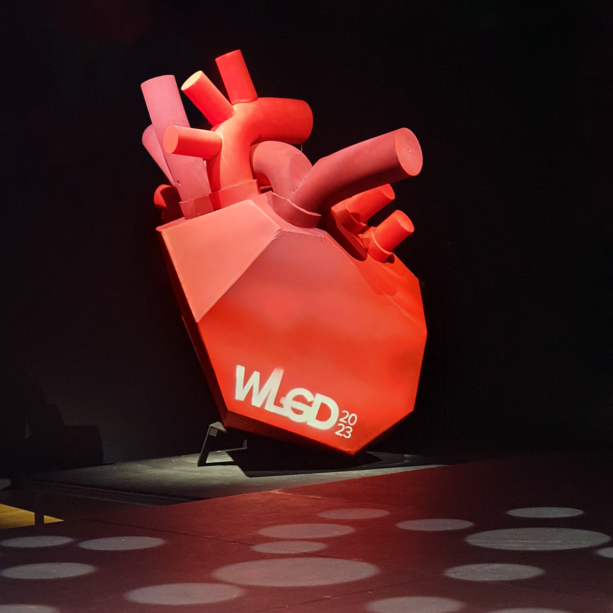
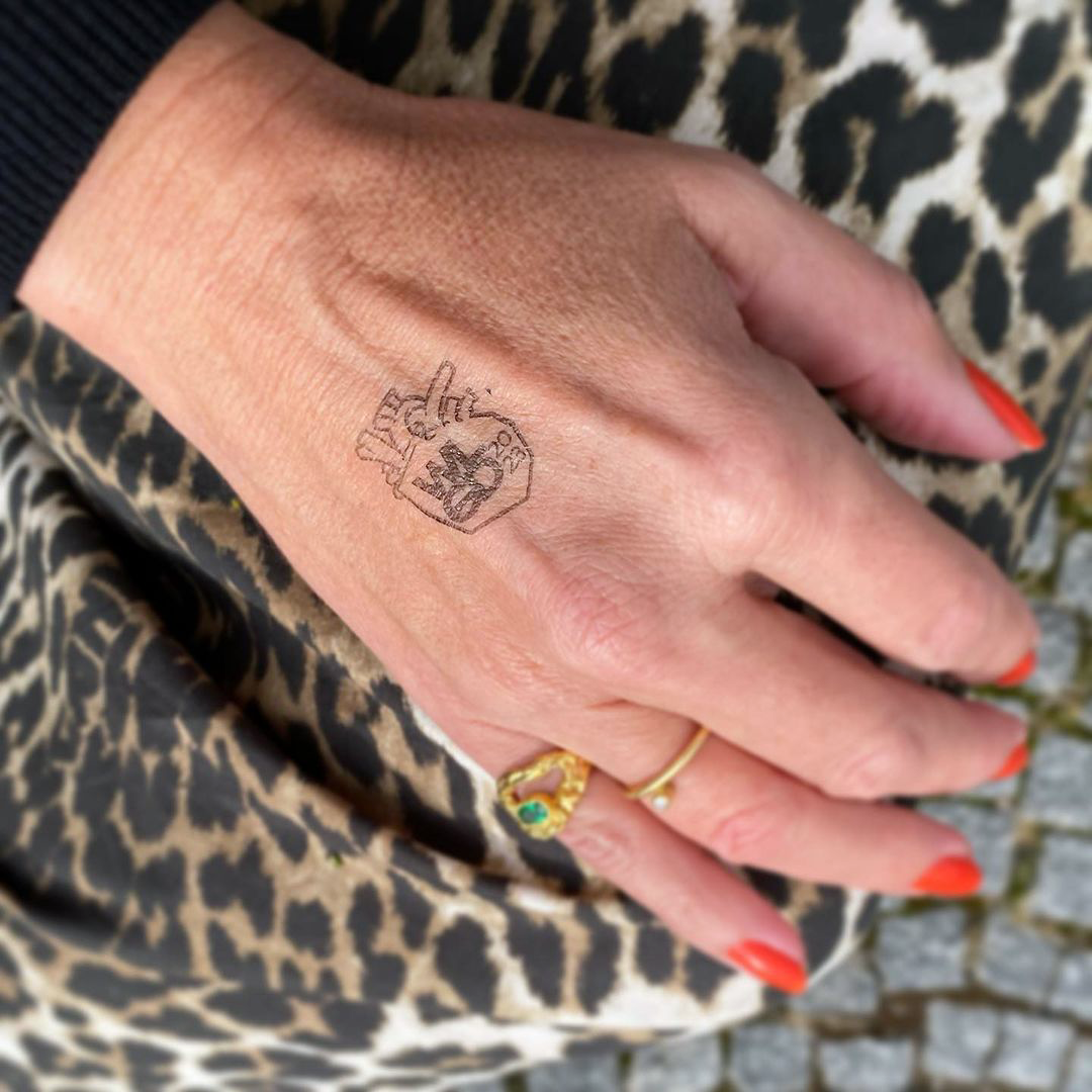
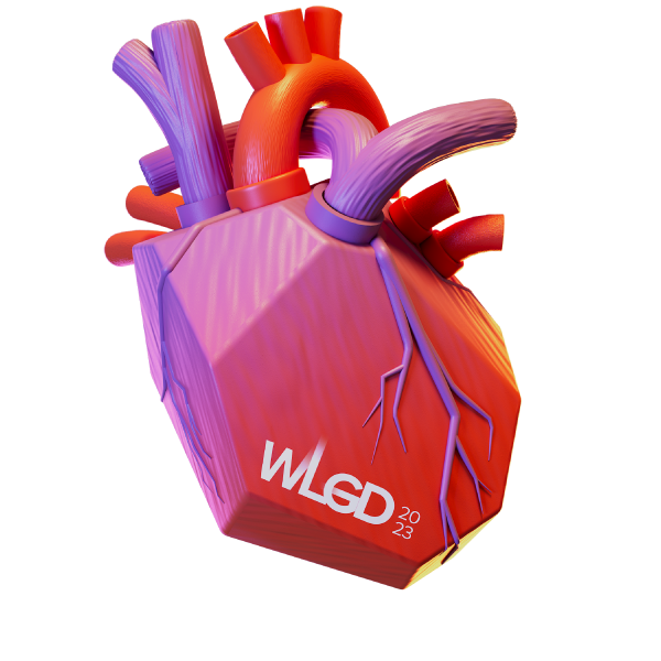
In Danish, you can say something is in your blood, meaning you have an innate or acquired skill or inclination towards something. That inspired the central element in the identity: a representation of the human heart.
SERVICES
Art direction, motion design, identity, scenography, print
CLIENT
We Love Graphic Design
HK grafisk kommunikation
Motion design
DIRECTION, DESIGN & MOTION: Lenike
MUSIC & SFX: Mikkel Max Jorn
OPENING TITLES
Motion design helps set the stage for the event, interspersing the speaker program with animated breakers and speaker intros. The day opens with an animated sequence (Opening Titles), introducing the speakers and setting the mood. Dimensionality becomes a focal point as we progress from point to line, then to shape, and ultimately to the form of the heart. Following the logo reveal, the speakers are introduced, with each speaker segment referencing a different style.
SPEAKER 01: EVA CREMERS
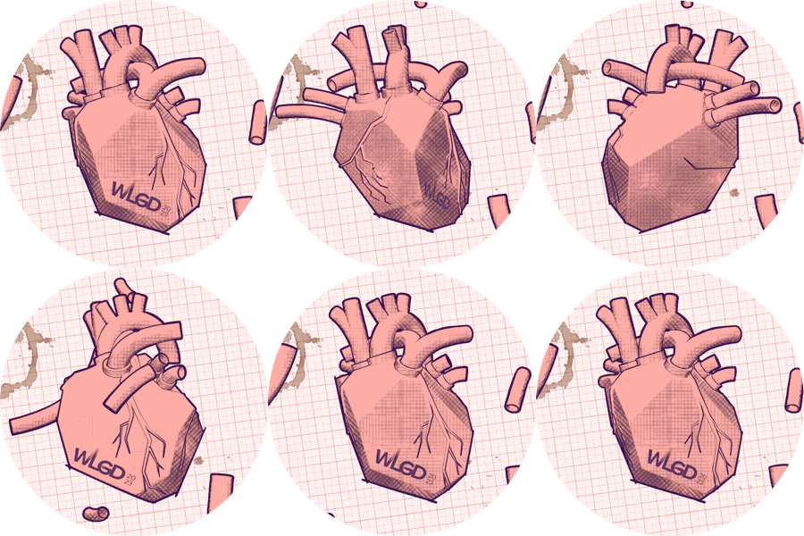
This intro draws inspiration from mixed media illustrators such as Bill Sienkiewicz, Svein Nyhus, and Darrel Rees. The aim was to create a crafty look with gritty elements and weird textures.
SPEAKER 02: ESRA GÜLMEN
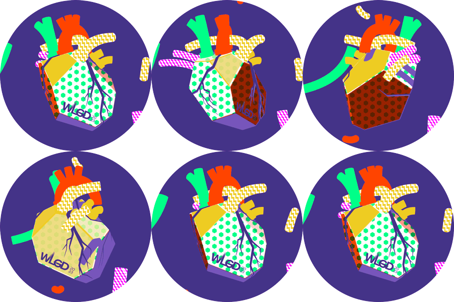
A humorous style with crude textures and clashing colors characterizes this intro. The flowing, zooming, and twisting lines are a recurrent motif from the initial segment of the opening titles.
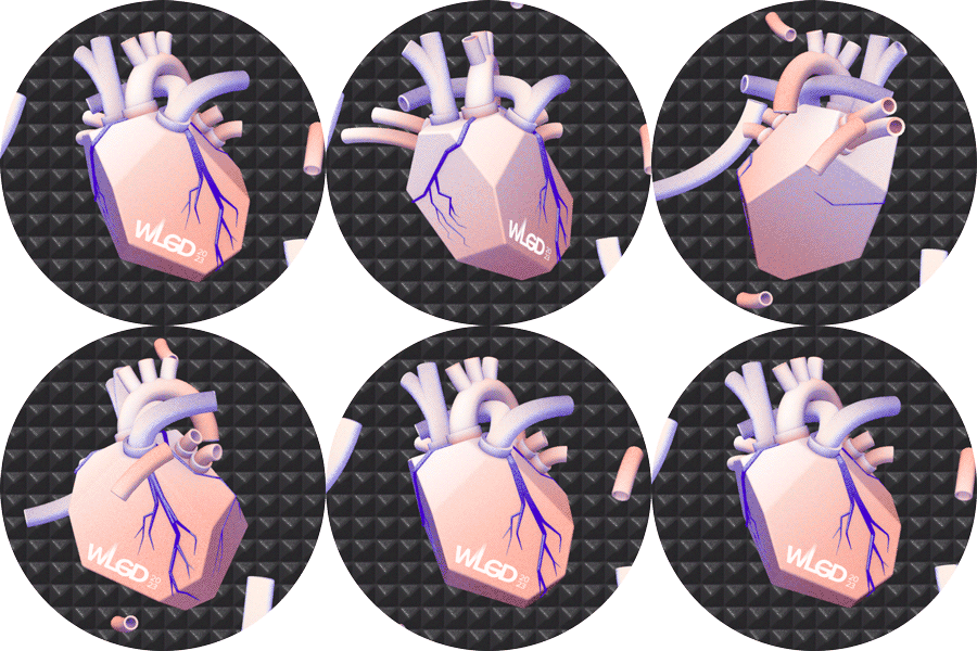
SPEAKER 03: MATILDE DIGMANN
Research into RISO printing produced examples of geometric work with an almost architectural quality. That inspired the creation of a city-like constellation, building the speaker’s name from geometric blocks.
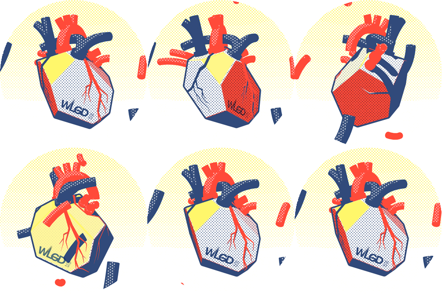
SPEAKER 04: STIG MØLLER HANSEN
This intro plays with simpler shapes, incorporating comic-strip aesthetics like visible raster and a Roy Lichtenstein-inspired palette.
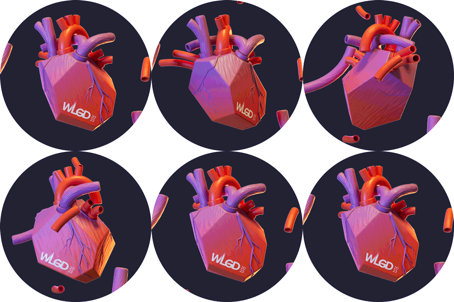
SPEAKER 05: Bo Bergstedt
While referencing the identity with blood cells and arteries, this segment aspires to create a polished, photorealistic, studio-like 3D aesthetic.
Breakers
Following each speaker, a short breaker animation helped set the stage for the next speaker. The breakers had the heart rotating, metaphorically turning a page, switching from one style to another. This final breaker went through all five styles.


